Minimalism vs. Mess: How Cluttered Websites Kill Conversion Rates
A website packed with every piece of information your company has ever produced doesn’t make you look like an expert; it makes you look disorganized.
When potential customers are forced to dig through a digital junk drawer of overlapping pop-ups, massive walls of text, and competing calls-to-action, they will simply leave and fetch their business from a competitor whose digital house is in order.
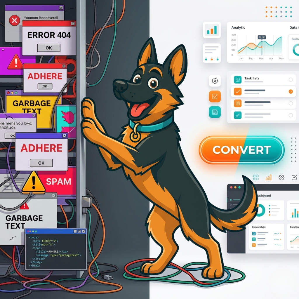
Imagine walking into a physical retail store where the aisles are so crammed with boxes that you can barely push a shopping cart. The walls are plastered with conflicting neon signs, a salesperson immediately jumps in front of you with a clipboard before you can even see what they sell, and the checkout register is completely hidden behind a mountain of clearance items. You wouldn’t stick around to figure it out; you would turn around and walk right back out the door. Your website functions exactly the same way. In the fast-paced digital landscape of 2026, user attention spans are measured in milliseconds. If a visitor lands on your homepage and immediately feels overwhelmed by visual clutter, their brain registers that friction as a threat, and they will abandon your site without a second thought.
At Stark Create, we frequently rescue clients from “bad actors” in the marketing agency world who believe that more is always better. These shady developers will sell you bloated, overly complex website packages, justifying their high invoices by cramming your digital house full of useless widgets, auto-playing videos, and endless dropdown menus. As your Guardian of Integrity, we are here to tell you that this approach is completely backwards. A successful digital presence is not about showing the customer how much you can fit onto a screen; it is about guiding them to exactly what they need with zero friction. It is time to stop barking up the wrong tree with cluttered design and embrace the high-converting power of strategic minimalism.
The Psychological Toll of Cognitive Overload
In web design, there is a fundamental psychological principle known as “cognitive load.” This refers to the total amount of mental effort required to process information and make a decision. When your website is cluttered with five different font styles, clashing colors, three separate promotional banners, and a massive wall of unformatted text, you are maxing out your user’s cognitive load before they even read your headline.
This creates decision paralysis. The psychological concept of Hick’s Law states that the more choices you present to a person, the longer it will take them to make a decision. If you give a user 25 different links to click on your homepage, they are highly likely to click none of them. When a website is a mess, the user’s brain has to work incredibly hard just to separate the primary message from the background noise. People do not want to work hard to give you their money. If your digital house feels like a chore to navigate, your conversion rates will inevitably plummet.
The “Frankenstein” Website: How Digital Messes Accumulate
Very few business owners intentionally set out to build a cluttered website. Usually, digital clutter is the result of years of disorganized band-aids. We call this the “Frankenstein” website. It happens when you hire one agency to build the initial site, a different freelancer to add an e-commerce store, and a third marketing consultant who insists you install an aggressive pop-up widget.
Over time, you add a new service page here, a promotional banner there, and a chat bot in the corner. Because there is no overarching, cohesive strategy, the website slowly morphs into a chaotic monster. The navigation menu becomes a labyrinth, the brand colors lose all consistency, and the user journey is completely broken. To fix a Frankenstein website, you cannot just add another band-aid. You have to tear it down to the studs, audit every single element, and sweep away the inefficiencies. If a feature or a block of text does not directly serve your core business goals, it has to go.
Minimalism is Intentional, Not Empty
When business owners hear the word “minimalism,” they often panic. They assume it means their website will just be a blank white screen with a tiny logo and one sentence of text, stripping away their brand’s personality. This is a massive misconception. In high-converting web design, minimalism does not mean “empty”; it means “intentional.”
Strategic minimalism is about aggressively prioritizing your content. It is the practice of removing everything that distracts from your primary message. Every single element on the screen—every image, every sentence, every button—must justify its existence. If an element does not educate the user, build trust, or drive a conversion, it is digital clutter. By removing the unnecessary noise, you actually amplify your core message, making your brand’s true value proposition impossible to miss.
The Rule of One: Clarifying Your Calls-to-Action
One of the most destructive forms of digital clutter is the competing Call-to-Action (CTA). A messy website will often ask a user to do five different things at the exact same time: “Subscribe to our newsletter!” “Follow us on Instagram!” “Read our latest blog!” “Call us today!” “Buy this product now!”
When you shout five different commands, the user hears nothing but noise. To dramatically increase your conversion rates, you must implement the “Rule of One.” Every single page on your website should have one primary goal. If it is a service page, the only goal should be getting the user to request a quote. If it is a blog post, the goal might be capturing their email address. Remove the competing buttons and guide the user’s eye toward a single, bold, highly contrasted CTA. Make the path to purchase as obvious and frictionless as a well-lit runway.
White Space is Your Most Profitable Digital Asset
If you want to organize your digital house, you need to learn to love white space (also known as negative space). White space is the empty area between your text, images, and buttons. Bad web designers view white space as wasted real estate that needs to be filled with more graphics or text. Professional designers view white space as the most critical tool in their arsenal.
White space acts as the visual breathing room for your website. It breaks up complex information into digestible, bite-sized chunks. It draws the user’s eye exactly where you want it to go, highlighting your headlines and making your CTA buttons pop off the screen. A website with generous, intentionally designed white space feels luxurious, professional, and calming. It tells the user, “We are confident in our services, and we respect your time enough to make this easy.”
Stop Chasing Your Tail and Clean Up Your Digital House
Your website should be your hardest-working employee, consistently fetching highly qualified leads and driving real revenue. But if that employee is disorganized, messy, and confusing to talk to, they are actively costing you business. It is time to stop letting digital clutter hold your brand back.
You don’t have to tackle this deep clean alone. At Stark Create, we specialize in transforming chaotic, underperforming websites into sleek, streamlined, lead-generating machines. We handle the structural design, the user experience, and the technical clean-up so your true brand value can shine through. If you are ready to give your online presence a serious pup-grade and start converting visitors into loyal customers, we are ready to lead the way. Visit our
page or call the Stark Create team directly at
to discuss how we can sweep away the mess and build a digital strategy that truly works.
Disclaimer: The information provided in this article is for educational and informational purposes only and does not constitute professional marketing, financial, or legal advice. Contact Stark Create for custom strategies and solutions tailored specifically to your business needs.
Stark Create
We build, we create, we solve — WordPress, custom development, and the strategy to grow online. No gatekeeping, no fluff.
Want a site where nothing's a dead end?
We build WordPress sites that are fast, findable, and handled down to the 404 page.