Mobile-First is Old News: Welcome to the Mobile-Only Mindset
For years, web designers told businesses they needed a “mobile-first” website to succeed, but in the current digital landscape, that advice is completely outdated.
Today, the vast majority of your local customers will never even see the desktop version of your site, meaning you must adopt a “mobile-only” mindset to truly fetch real business.
If you hired a digital marketing agency anytime in the last decade, you probably heard them brag about their “mobile-first” design approach. It sounded great at the time. The theory was that they would design the mobile version of your website first to ensure it worked on small screens, and then they would expand and add bells and whistles for the desktop version. But as we navigate the fast-paced realities of 2026, that methodology has a massive, glaring flaw: it still assumes that the desktop website is the final, ultimate version of your brand’s digital house.
At Stark Create, we believe in dealing with reality, not outdated industry jargon. As your Guardian of Integrity, we are here to tell you that for most local and service-area businesses, the desktop website is practically a ghost town. When your customers need a roofer, a dog groomer, an emergency plumber, or a new dentist, they aren’t booting up their laptops and sitting at a desk. They are pulling their smartphones out of their pockets while standing in their kitchens, sitting in traffic, or waiting in line at the grocery store. Bad actors in the web design space will still try to sell you expensive, massive desktop layouts because they look impressive in a boardroom pitch. But if you want to stop barking up the wrong tree and start converting real leads, you need to completely shift your perspective. Welcome to the mobile-only mindset.
The Boardroom Trap: Why Agencies Still Push Desktop Design
To understand why the mobile-only mindset is so revolutionary, you have to understand why the industry has been so slow to adopt it. It comes down to how websites are sold. When an agency pitches a new website to a business owner, they usually do it in a conference room. They hook a laptop up to a massive 65-inch television screen and unveil a stunning, wide-screen desktop mockup full of sweeping video backgrounds, intricate hover animations, and complex mega-menus.
The business owner is wowed by the presentation, signs the check, and waits for the site to launch. But this is the digital equivalent of an illusion. The agency designed the site for the massive screen because it looks great in a pitch meeting. The mobile version is then treated as an afterthought—a cramped, squished-down version of the desktop site where the video doesn’t play right, the text is too small, and the menus are impossible to navigate. If 80% to 90% of your traffic is coming from mobile devices, approving a website based on how it looks on a giant television screen is a recipe for disaster.
What Does “Mobile-Only” Actually Mean?
Adopting a mobile-only mindset doesn’t mean you literally delete your desktop website. People will still occasionally visit from a computer, and your site should be responsive enough to accommodate them. What it means is that your entire strategic focus—your user experience (UX), your conversion funnels, your content layout, and your site architecture—is built under the assumption that a mobile screen is the
only
screen that matters.
In a mobile-first approach, designers often hide the best features or the longest content on the mobile version, saving the “full experience” for desktop. In a mobile-only mindset, there is no hidden content. The mobile version
is
the full experience. If a feature, a paragraph of text, or a graphic doesn’t work perfectly on a six-inch piece of glass, it gets thrown out entirely. You stop designing for a mouse and a keyboard, and you start designing exclusively for the human thumb.
Designing for the “Thumb Zone”
When you use a desktop computer, your mouse can quickly and easily travel to any corner of the screen with pinpoint accuracy. Smartphones are completely different. The way humans physically hold their phones dictates how they interact with your digital house.
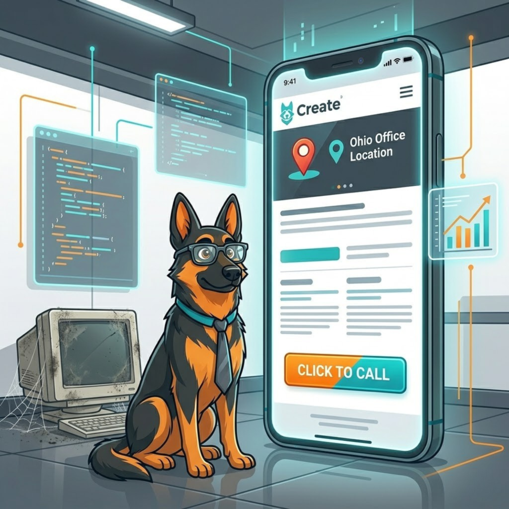
UX researchers refer to the “Thumb Zone”—the area of a smartphone screen that a user can easily reach with their thumb while holding the device with one hand. The center and bottom of the screen are the most accessible areas, while the top corners (especially on modern, oversized phones) require the user to awkwardly stretch or use their other hand. A mobile-only web design places all critical navigation elements, calls-to-action (CTAs), and contact buttons directly in the natural Thumb Zone. If your “Request a Quote” button is buried in a tiny “hamburger” menu at the very top right corner of the screen, you are actively creating physical friction for your user.
The Death of the “Hover State”
One of the most common mistakes we fix when rescuing clients from bad marketing agencies is the reliance on “hover states.” On a desktop, a user can hover their mouse cursor over an image to reveal text, or hover over a menu item to reveal a dropdown list of services.
Hover states do not exist on smartphones. You cannot hover a finger; you can only tap. If your website requires a user to hover to understand your services or access important links, your mobile users are completely locked out of that information. A mobile-only mindset eliminates these hidden traps. Menus must be built with clear, tappable accordions. Buttons must look like buttons, with distinct borders and contrasting colors, so the user knows exactly what to tap without having to guess. Everything must be instantly visible and tactile.
Streamlining the Mobile Conversion Funnel
A user on a smartphone is inherently distracted. They might be dealing with a crying child, walking down a busy street, or rushing to their next meeting. They have significantly less patience than someone sitting quietly at a desk. Therefore, your mobile conversion funnel must be aggressively streamlined.
If a customer wants to contact you, they should not have to pinch and zoom to read a massive, 15-field contact form. A mobile-only approach utilizes persistent, sticky CTA buttons that follow the user down the screen, so the option to convert is always a thumb-tap away. It utilizes “Click-to-Call” phone numbers that instantly launch the phone’s dialer. It replaces long, typed-out forms with simple dropdown menus and integrates seamlessly with digital wallets like Apple Pay and Google Pay, allowing users to complete transactions with a single glance rather than typing out a 16-digit credit card number on a tiny digital keyboard.
Your Speed Limit is Dictated by the Cell Tower
Finally, a mobile-only mindset completely changes how you view website performance. When you sit in an office testing your website on a blazing-fast gigabit Wi-Fi connection, everything loads instantly. But your customer might be trying to load your website on a spotty 4G cellular connection in the back of a moving Uber.
If your website is bloated with massive, uncompressed images, heavy background videos, and unnecessary code, it will simply time out and fail to load on a weak mobile connection. Adopting a mobile-only philosophy means prioritizing ruthless efficiency. You compress every asset, eliminate unnecessary scripts, and build a digital house that is lightweight and lightning-fast, regardless of the user’s network strength.
Let Stark Create Pup-Grade Your Mobile Strategy
Transitioning from an outdated desktop mentality to a high-converting, mobile-only strategy is the single most profitable shift a local business can make in 2026. You cannot afford to let a bad digital agency build you a beautiful billboard that nobody can read on their phones.
At Stark Create, we design digital experiences that respect the reality of modern consumer behavior. We build for the thumb, we optimize for the cell tower, and we ensure that your digital front door is always perfectly aligned with the devices your customers actually use. If you are ready to stop leaving money on the table with a clunky, squished-down mobile site, it is time to call in the experts. Visit our
page or call the Stark Create team directly at
to discuss your true mobile pup-grade today.
Disclaimer: The information provided in this article is for educational and informational purposes only and does not constitute professional marketing, financial, or legal advice. Contact Stark Create for custom strategies and solutions tailored specifically to your business needs.
Stark Create
We build, we create, we solve — WordPress, custom development, and the strategy to grow online. No gatekeeping, no fluff.
Want a site where nothing's a dead end?
We build WordPress sites that are fast, findable, and handled down to the 404 page.